Branding
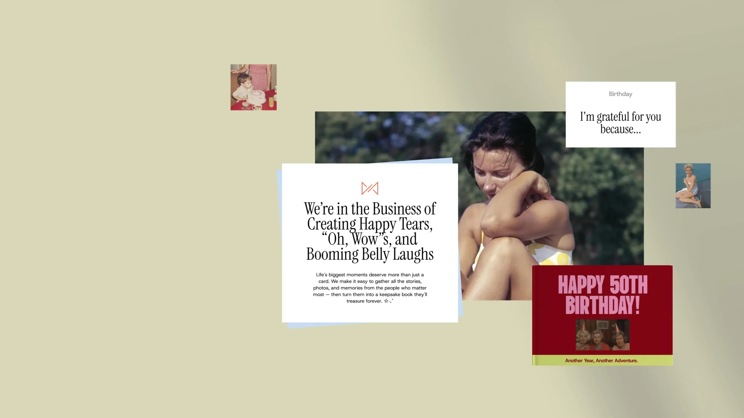
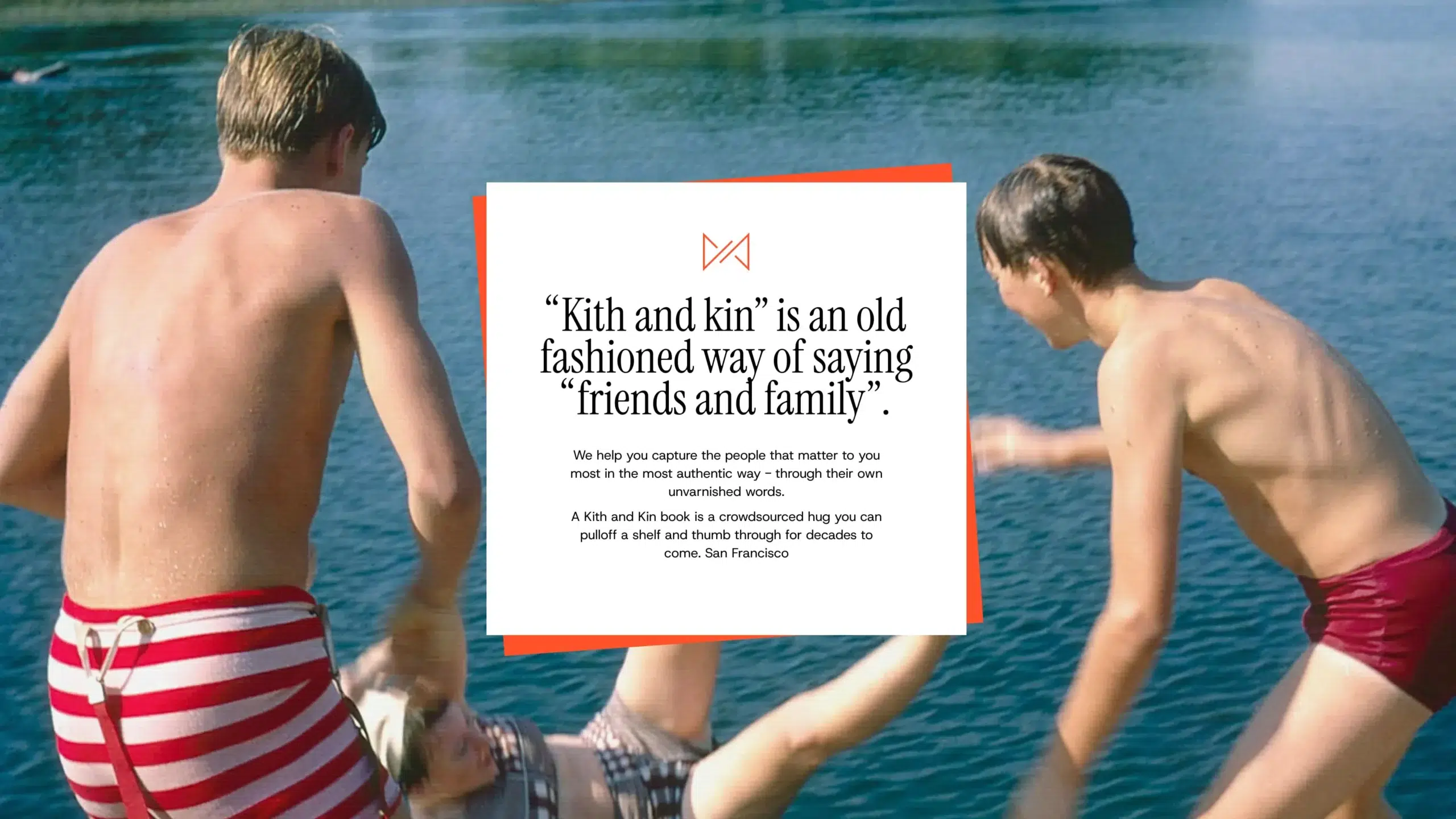
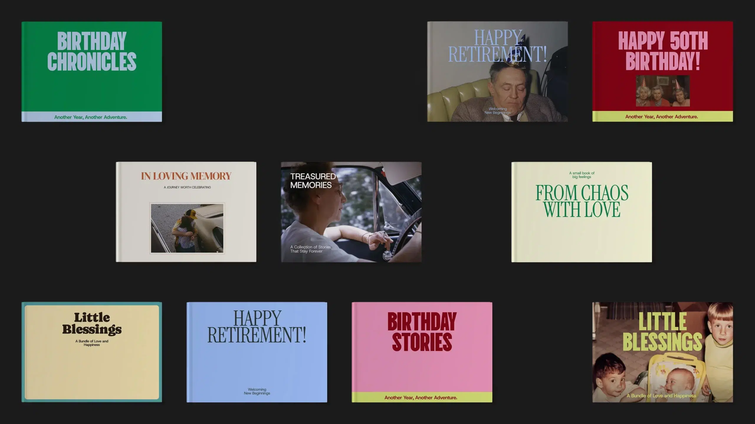
Unlike memories, which grow more valuable over time, branding needs to be refreshed to keep up with a fast-changing world. We started with a brand refresh rooted in the essence of Kith & Kin – warmth, connection, and storytelling.
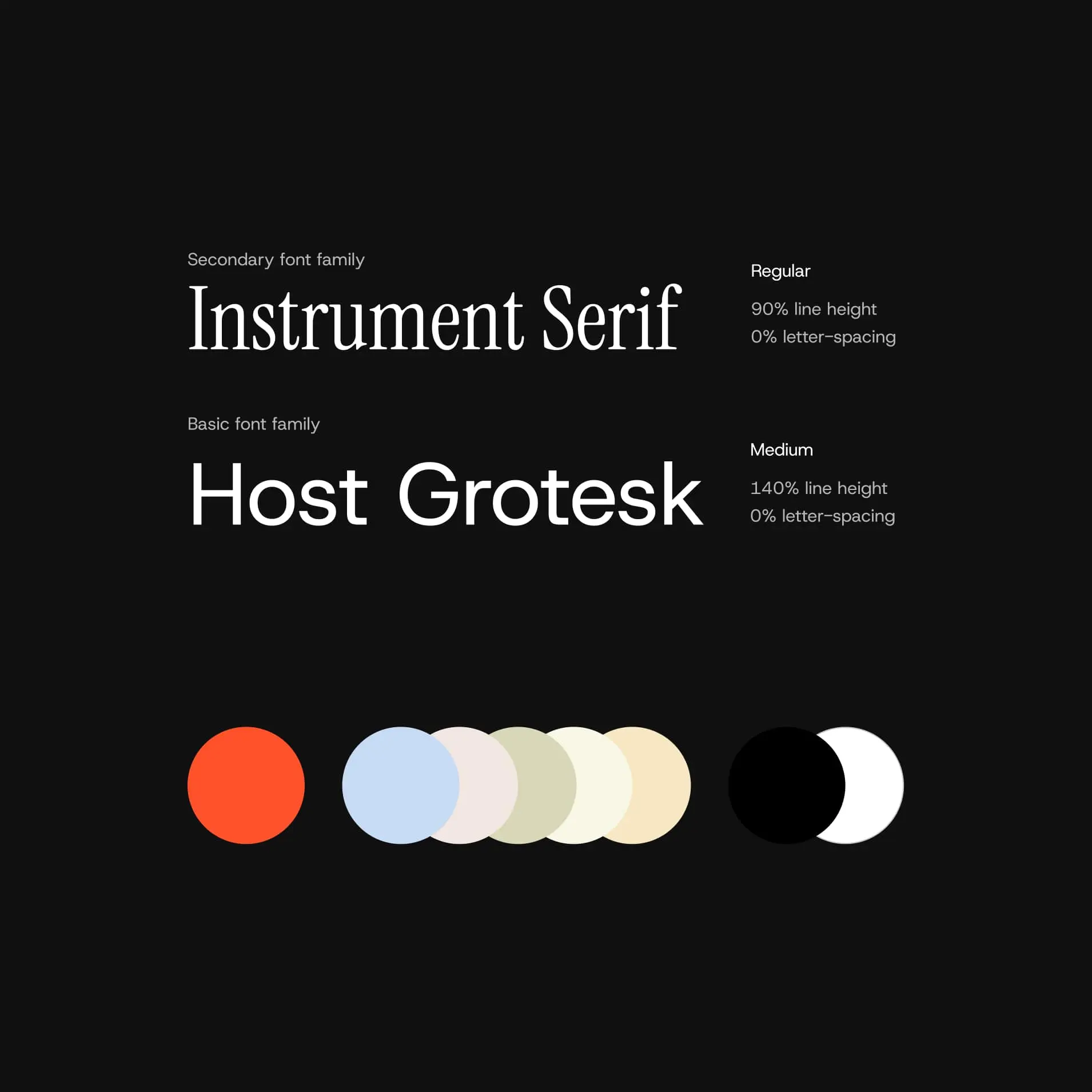
We focused on three pillars of the brand refresh: the logo, typography, and color palette. The logotype was simplified to feel more approachable and timeless. The typography was updated to bring clarity and softness: a better match for the brand’s emotional tone.
