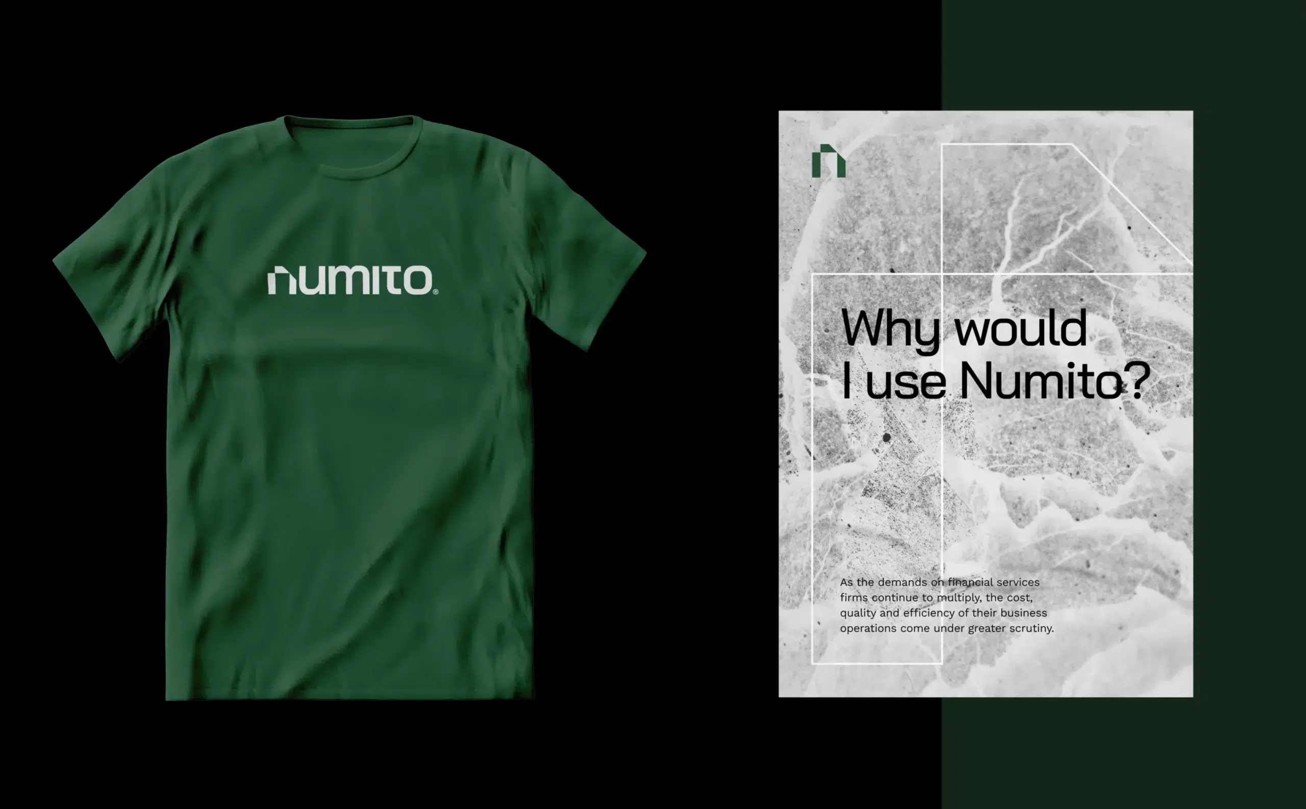
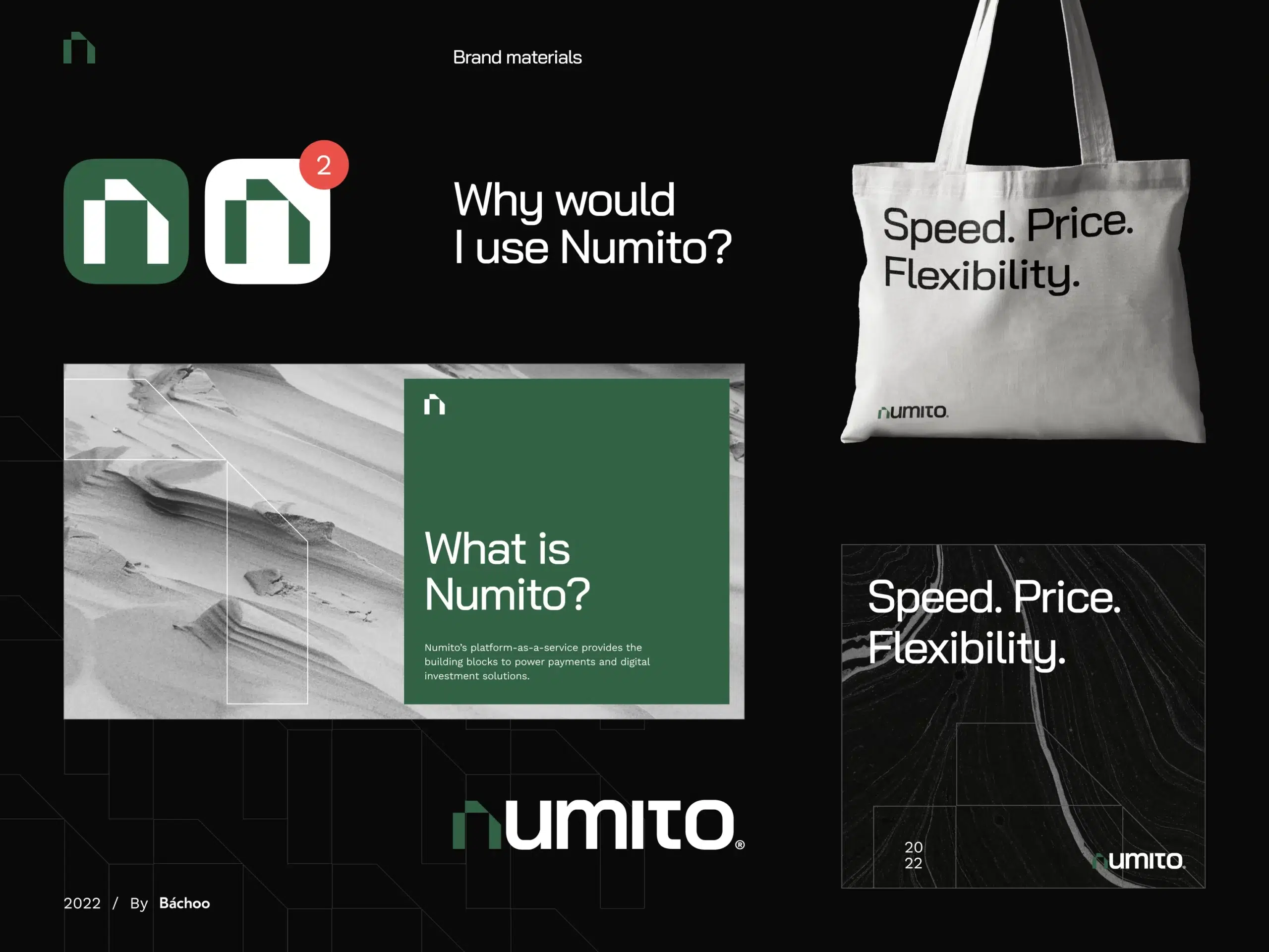
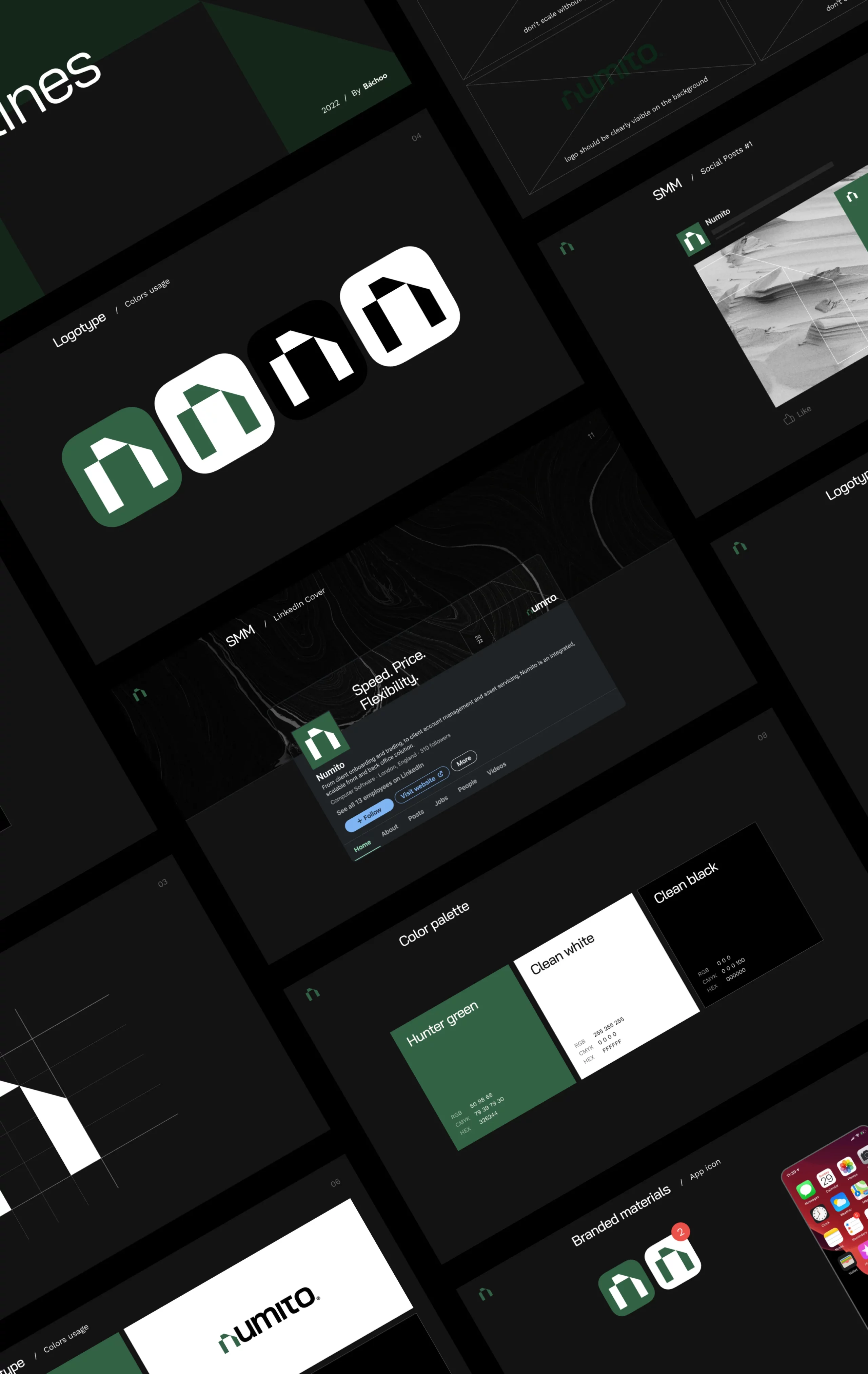
Cultural remix: Numito's Japan-infused branding revolution
The Challenge
Our mission was to make sure that Numito’s new product stands out in the competitive market. So we went all in and added some vibrant branding features to make it pop! We also made sure that it looks super fresh and trendy, with a modern and sleek design that’s perfect for today’s world. And to keep everyone happy, we balanced things out with a more formal and professional look that’s sure to impress the more conservative crowd.
Our Vision
Welcome to the wonderful world of Numito, where Japanese design and culture are taking center stage! Inspired by the beauty of origami, we folded and animated the first character of the startup’s name, creating an adorable little ‘N’ that looks just like real paper origami. The full logo is even more impressive, with the ‘N’ character modified to look like a Japanese hieroglyph. Our design techniques make it look like a square origami, so you can almost feel the paper between your fingers! And, as if that weren’t enough, we created an icon to represent the product application. It’s groundbreaking and we’re proud of it!
The Process
We didn’t just create a brand guide, we crafted a masterpiece. It’s got all the fancy bells and whistles – merch, social media design, typography, colors, and even a guide on how to use the logo. And with this guide, you’ll be a branding expert in no time!