Process
We began by listening to the team and interpreting the tone of voice subtly woven between the lines. It was a mix of quiet confidence and wit, representing a brand created by veterans and supported by technology.
Redeployable is an AI platform designed to help individuals with military experience transition to new civilian careers.
Their mission is clear: a military background should not be a barrier but rather an advantage. The platform enables veterans to transform their experiences into strength, purpose, and opportunities.
When the Redeployable team approached us, their product conveyed a human-centered idea, but the branding did not reflect it effectively. It felt distant and overly complex, failing to communicate the true spirit of their mission. Redeployable wanted to resonate more with the people it was built for – strong, authentic individuals. For us, it was an inspiring opportunity to support those whose values we genuinely share

We began by listening to the team and interpreting the tone of voice subtly woven between the lines. It was a mix of quiet confidence and wit, representing a brand created by veterans and supported by technology.
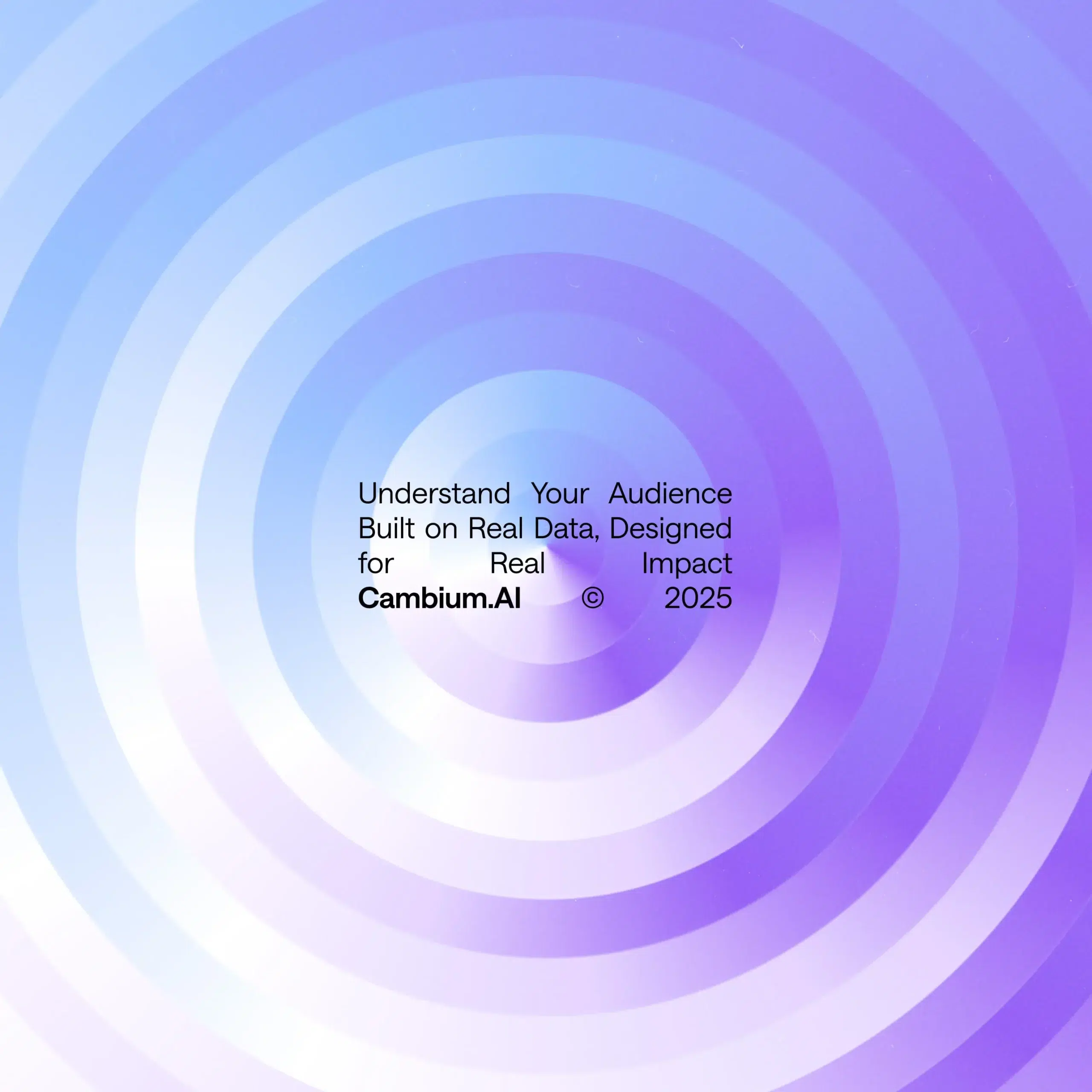
The existing branding was cluttered, featuring too many colors, shapes, and fonts competing for attention. Our goal was to simplify the design. In our initial mood boards, we explored concepts that reflected their narrative: the transition from military service to civilian life. This led to the idea of a sunset color palette with deep navy meeting warm orange, symbolizing the dawn of a new day. This concept became the emotional core of the new identity, serving not just as a color combination but as a metaphor for transformation.
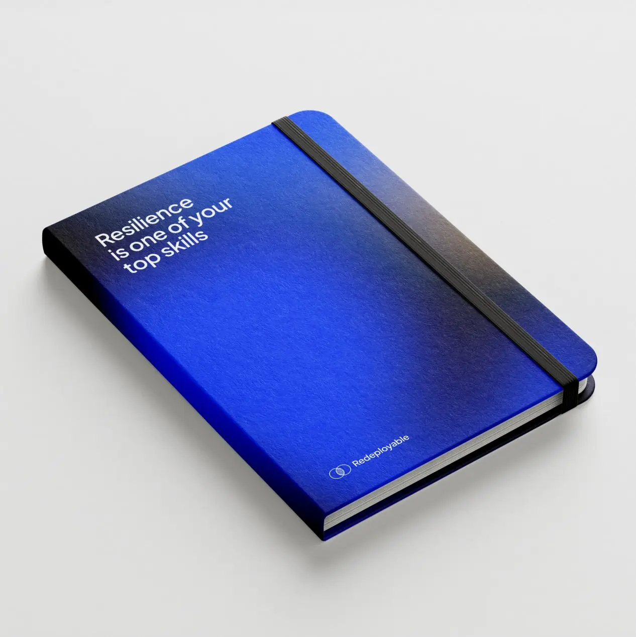

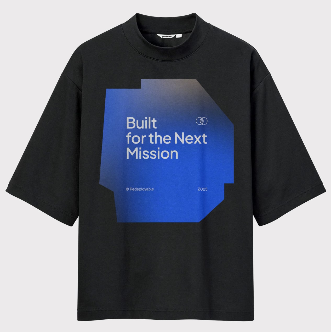
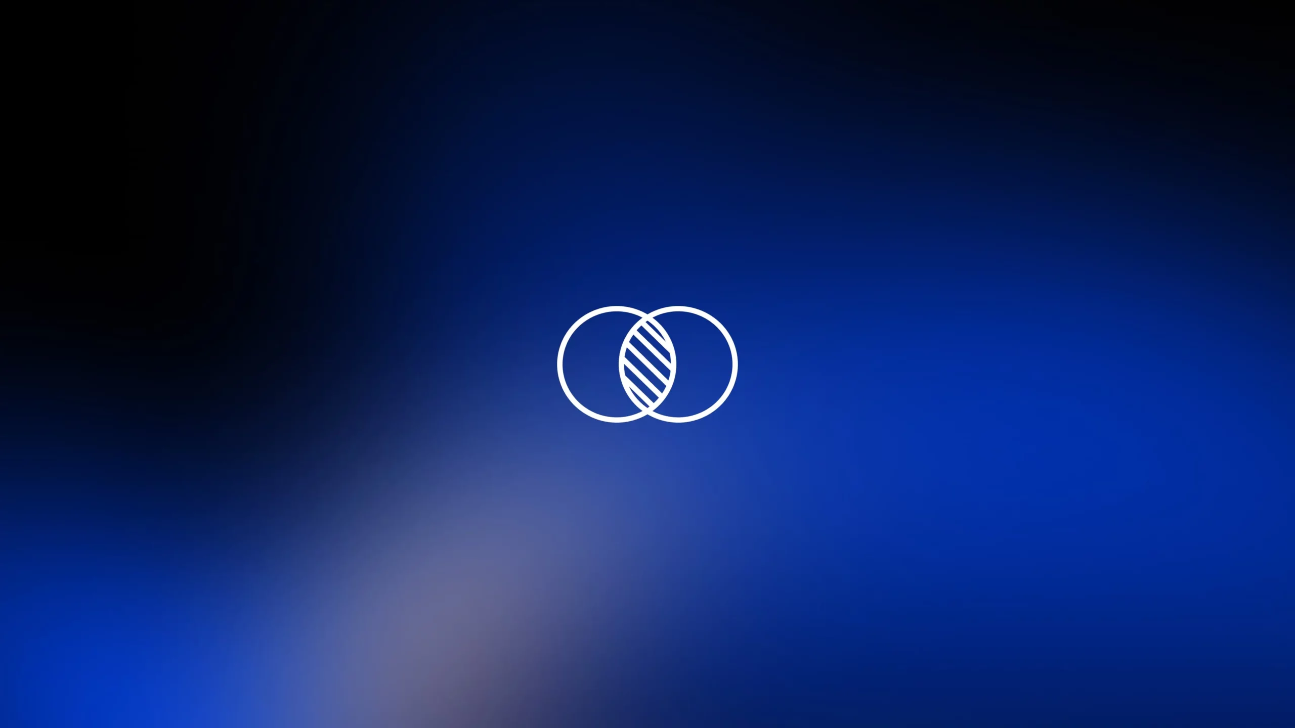
Working with an established product involves balancing the preservation of existing elements with necessary redefinition. We chose to maintain the original symbol, as it already had a meaningful story, but updated it to be sharper. The new wordmark was designed in a modern grotesque style, ensuring it feels timeless and adaptable across various media.
The color palette was made intentionally, with gradients softening into subtle nods to AI technology. The shape system evolved into a visual grammar, using simple forms that can combine into larger compositions, flexible yet instantly recognizable. This structure allows the team ample freedom to create new materials while maintaining a cohesive look.
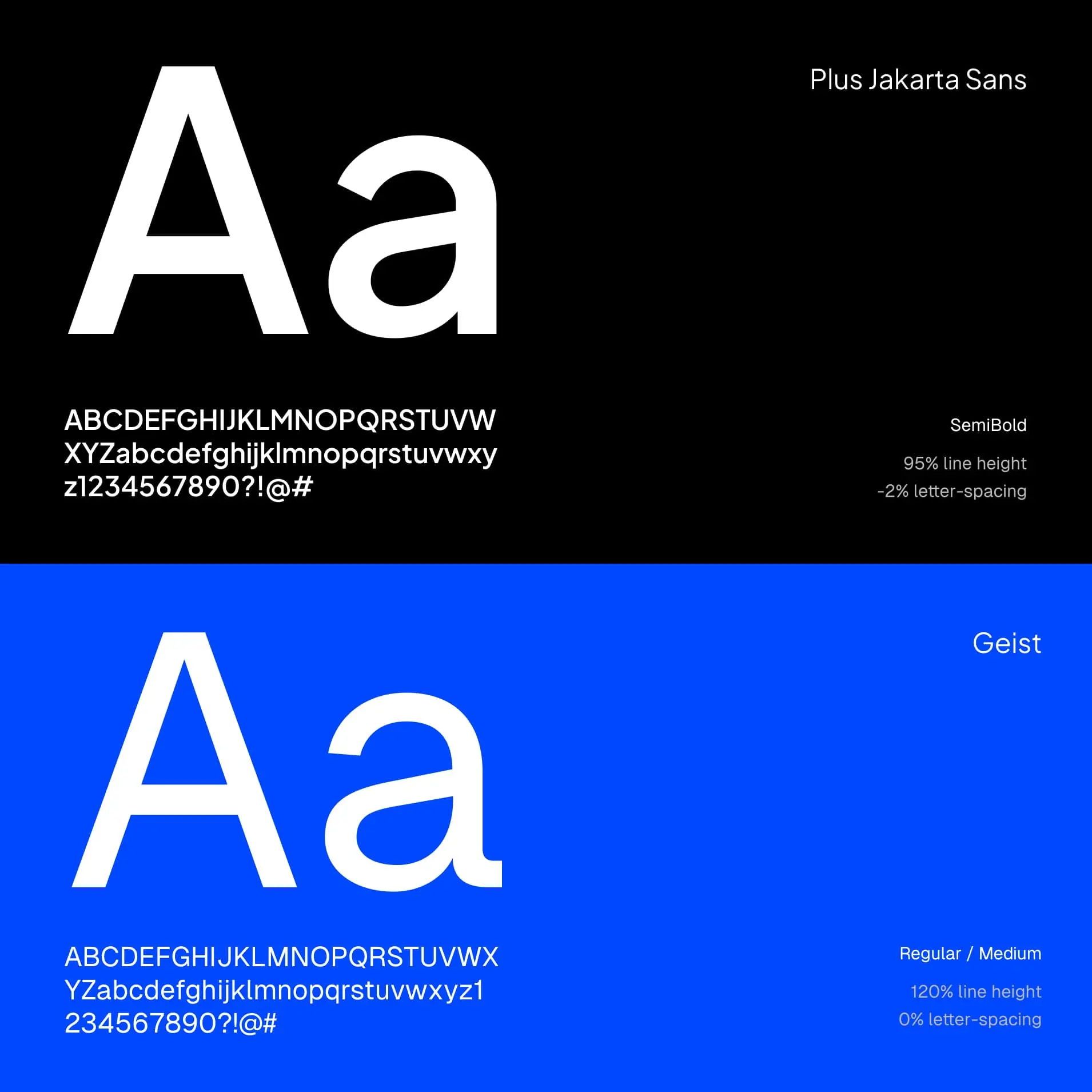
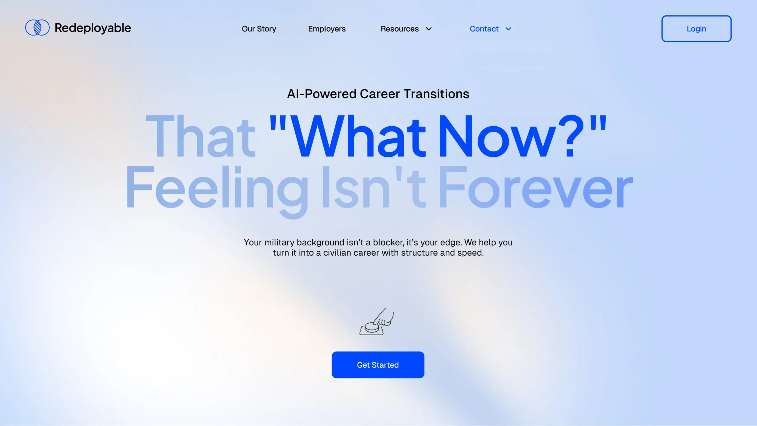
Typography and layout adhered to the principle of creating order without stiffness. Photography became the emotional core of the identity. We established guidelines that emphasized real images, steering clear of anything artificial or staged.
Redeployable’s new brand finally looks the way it feels: resilient, intelligent, and full of quiet strength. It speaks to veterans not as users, but as people standing at the beginning of a transformation. The product and the brand now move in harmony, turning experience into possibility.
The sooner you start, the sooner you’ll have it ready.