
Process
We began with moodboards and explored several visual directions, including different approaches to color, imagery, and overall brand expression.
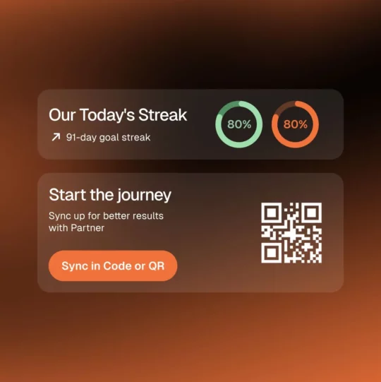
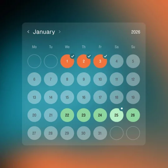
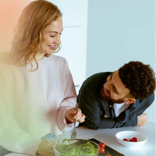
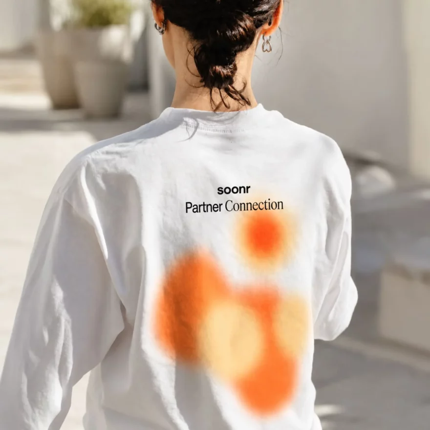
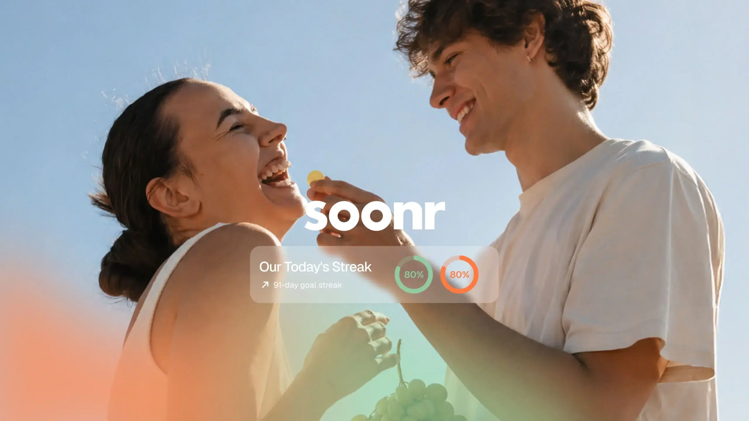
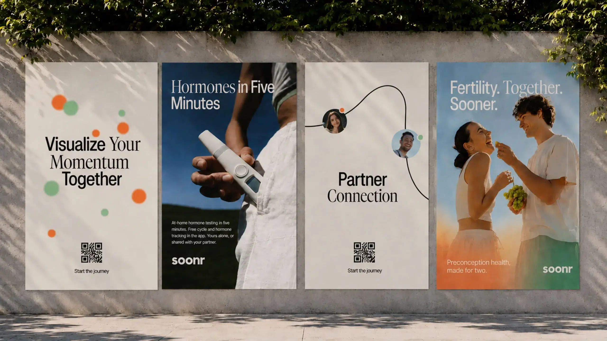
One of the key requirements was to preserve Soonr’s existing colors and maintain a clear distinction between his and hers. This created an interesting constraint: instead of replacing the palette, we had to find a new way for familiar colors to behave.
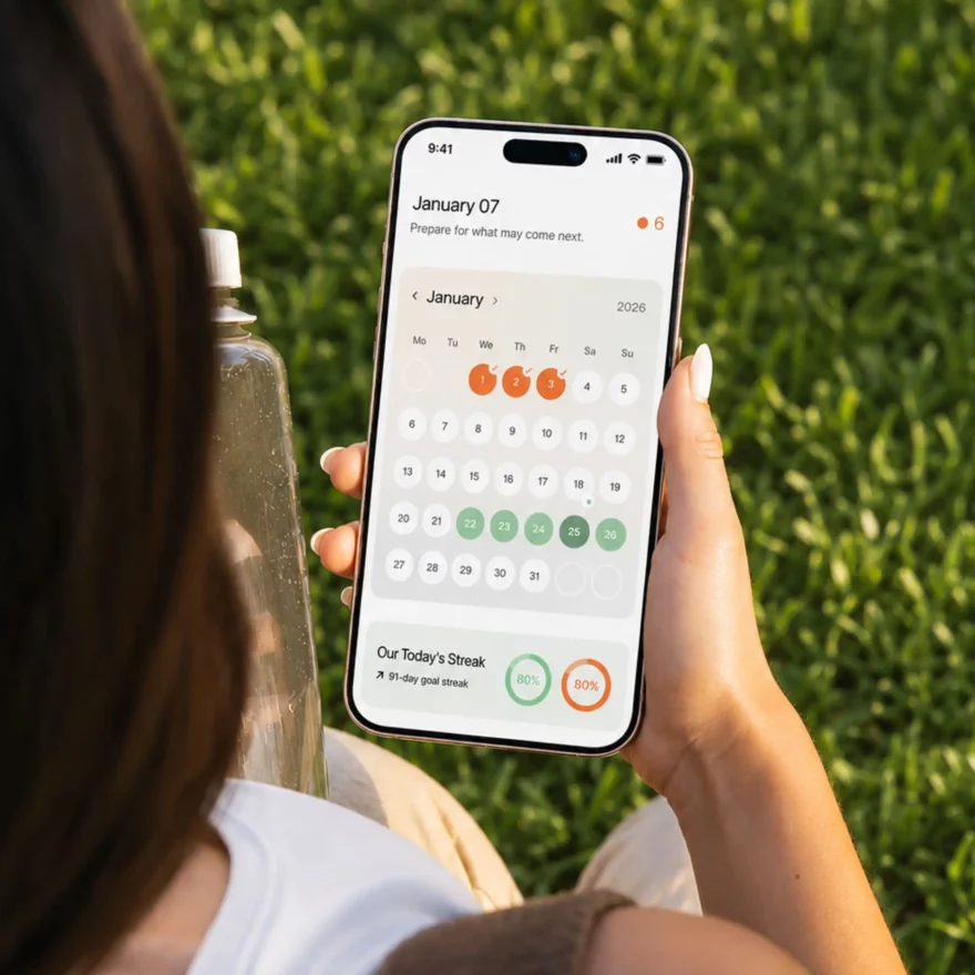
We refined the shades, softened their intensity, and explored how they could work both independently and together. This allowed us to retain recognition while shifting the brand from a vivid consumer app toward a calmer and more premium health experience.