Close
KGD Architecture
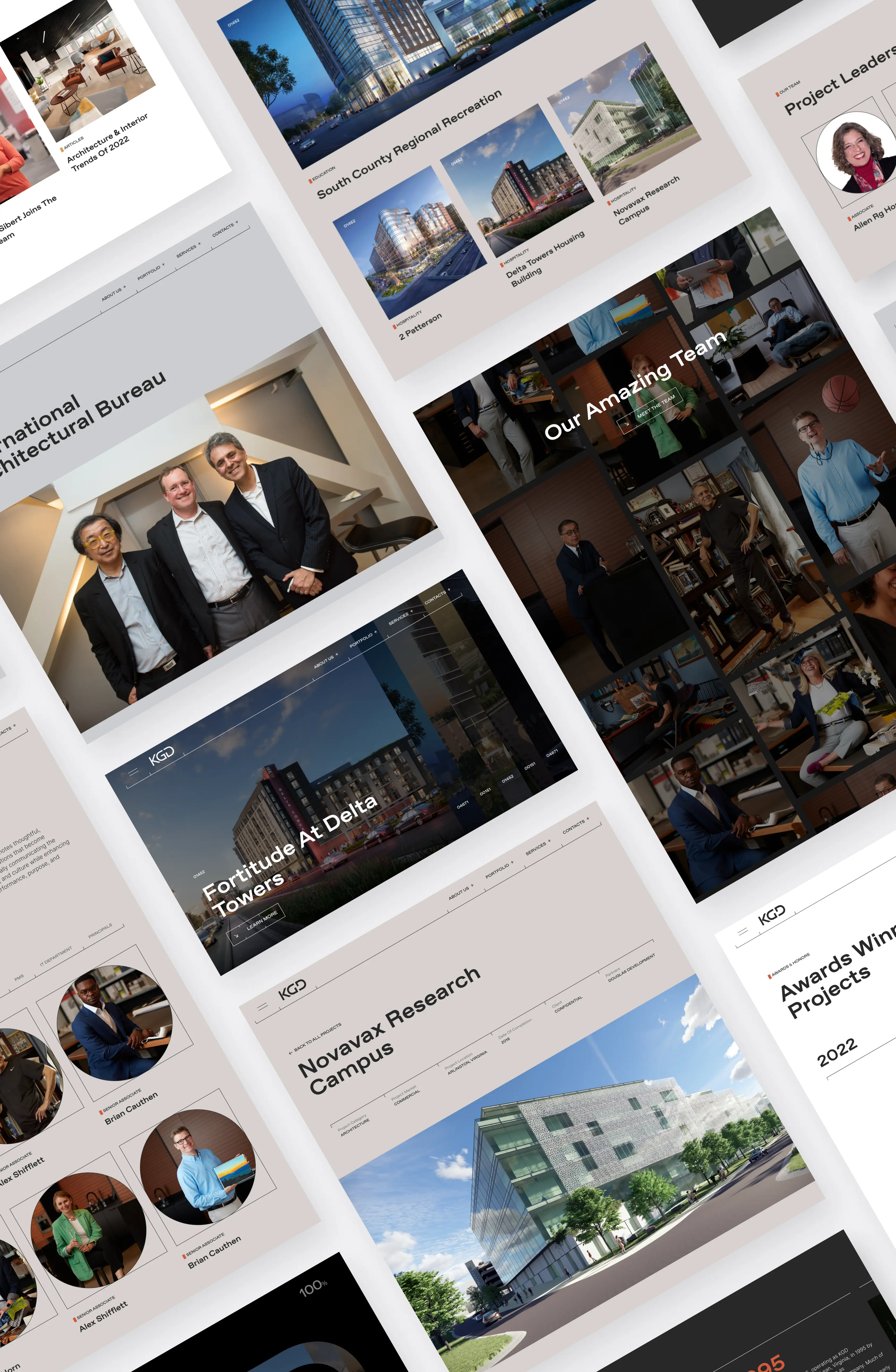
A Lofty Online Home for Architectural Excellence

KGD Architecture

KGD is a name that’s immediately familiar to those involved with architecture, for a good reason – with over 25 years of experience in the field, they’re responsible for many groundbreaking designs worldwide.

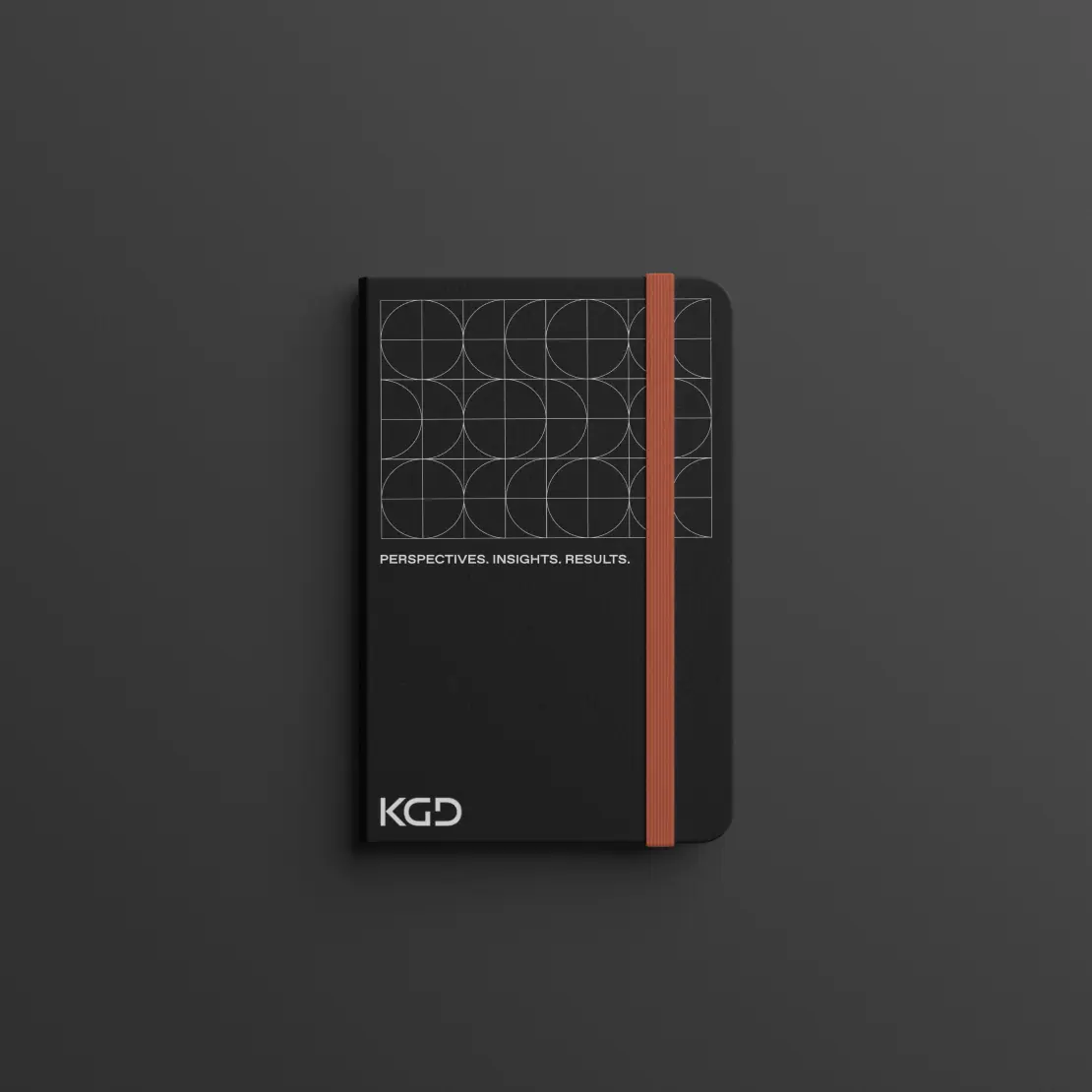
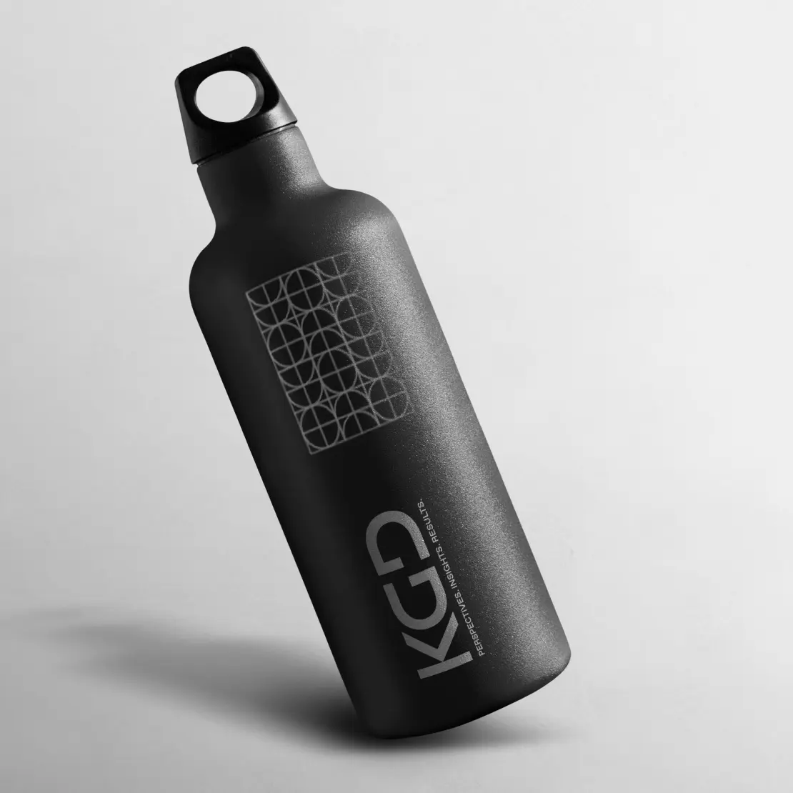
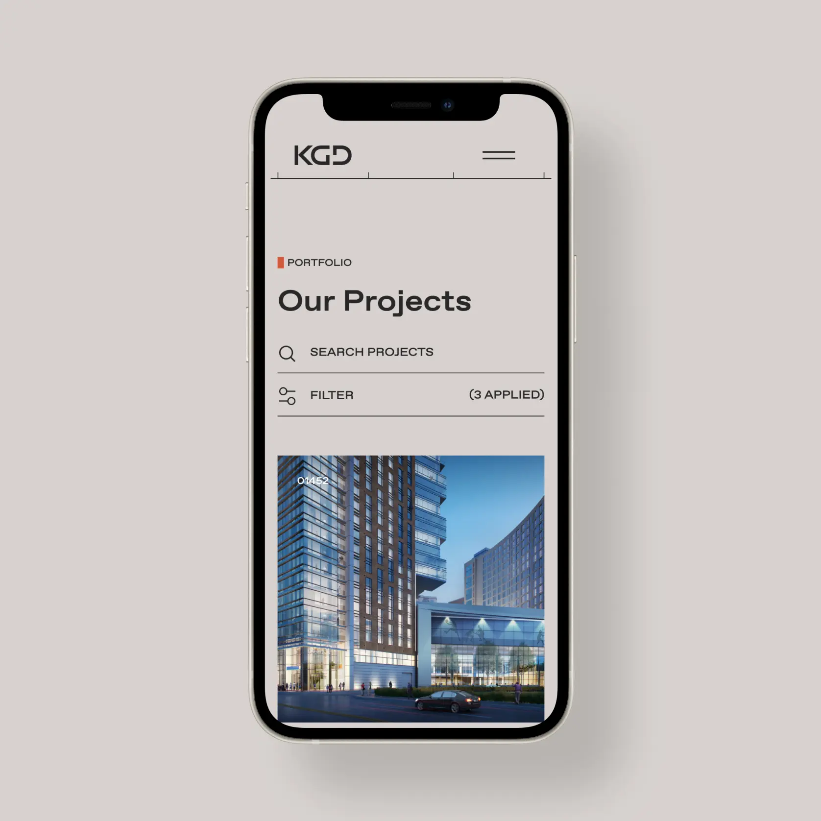
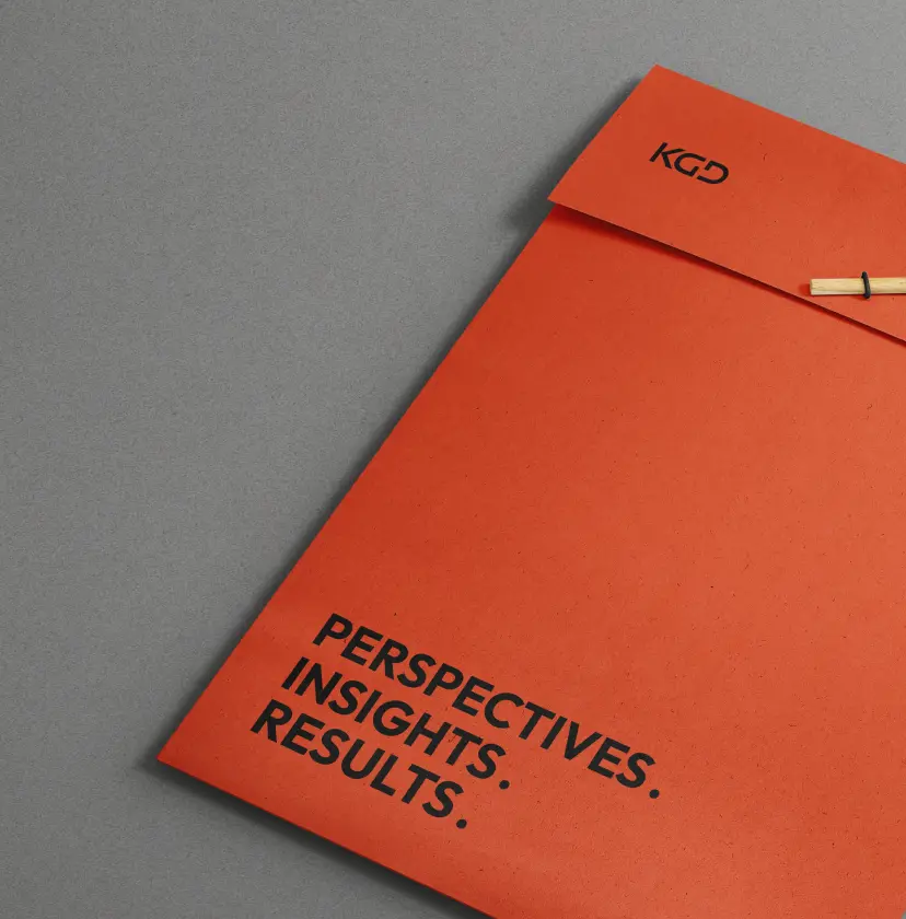
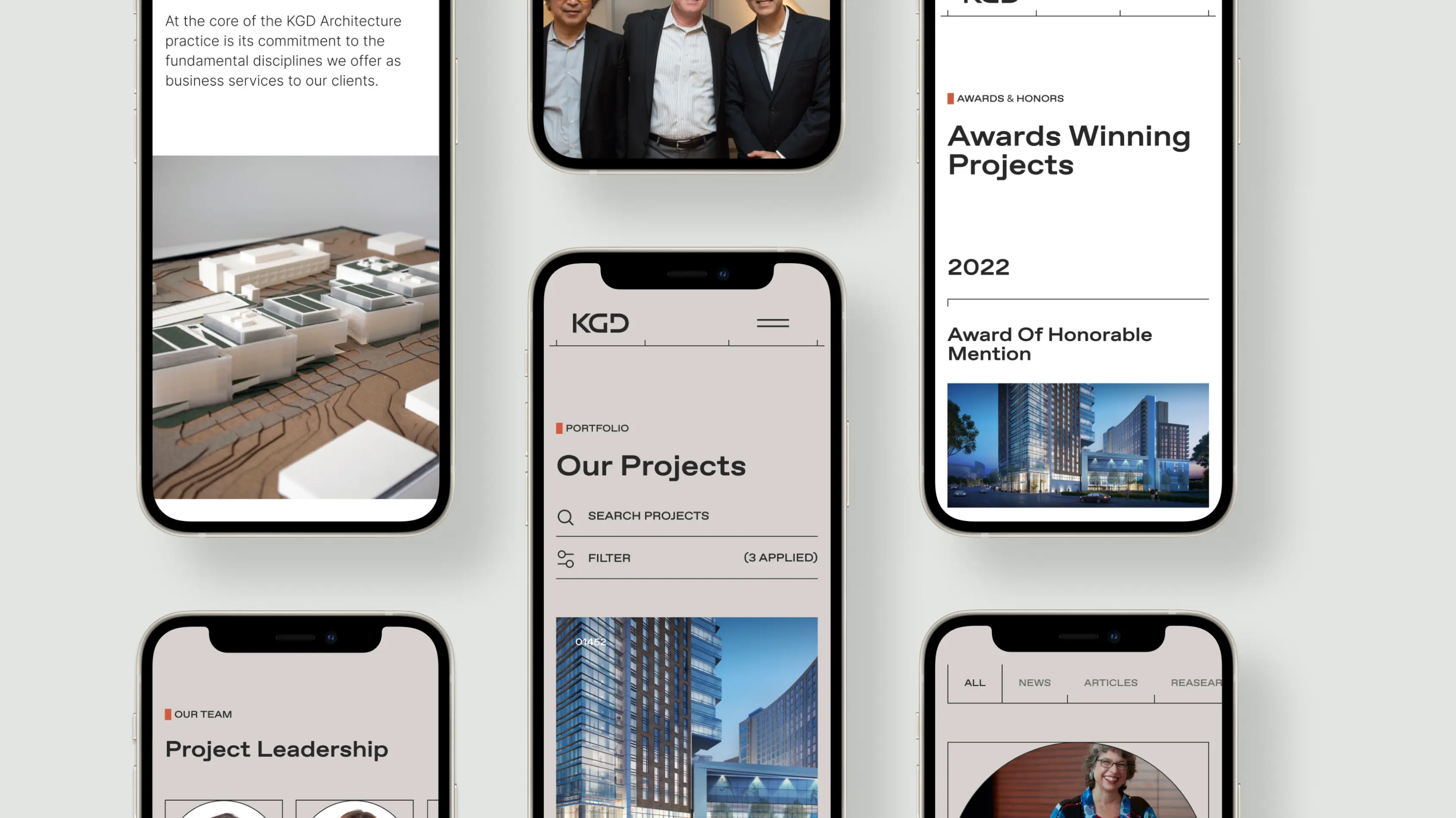
KGD asked us to design a new logo and visual branding that included a complete redesign of their website. Our digital architects quickly formed a unanimous line of thinking – we’re steering clear of the norm and basing the design on architectural schematics. This approach enabled us to communicate KGD’s values and goals in a way that’s topical, functional, and visually pleasing.

Project type
Branding Website
Services
3d Art Animation Brand Guidelines Brand identity Code-based Art Interaction Design Key Visuals Visual Communication Web Design Web Development
Technologies
GSAP WordPress
Frame 316124106
Frame 316124107
Frame 316124108
04

Logo Redesign

From the beginning, it was clear that KGD knew exactly what they wanted and showed up prepared with a comprehensive strategy. They introduced us to KGD’s core values that solidified over the bureau’s 20+ years of existence.

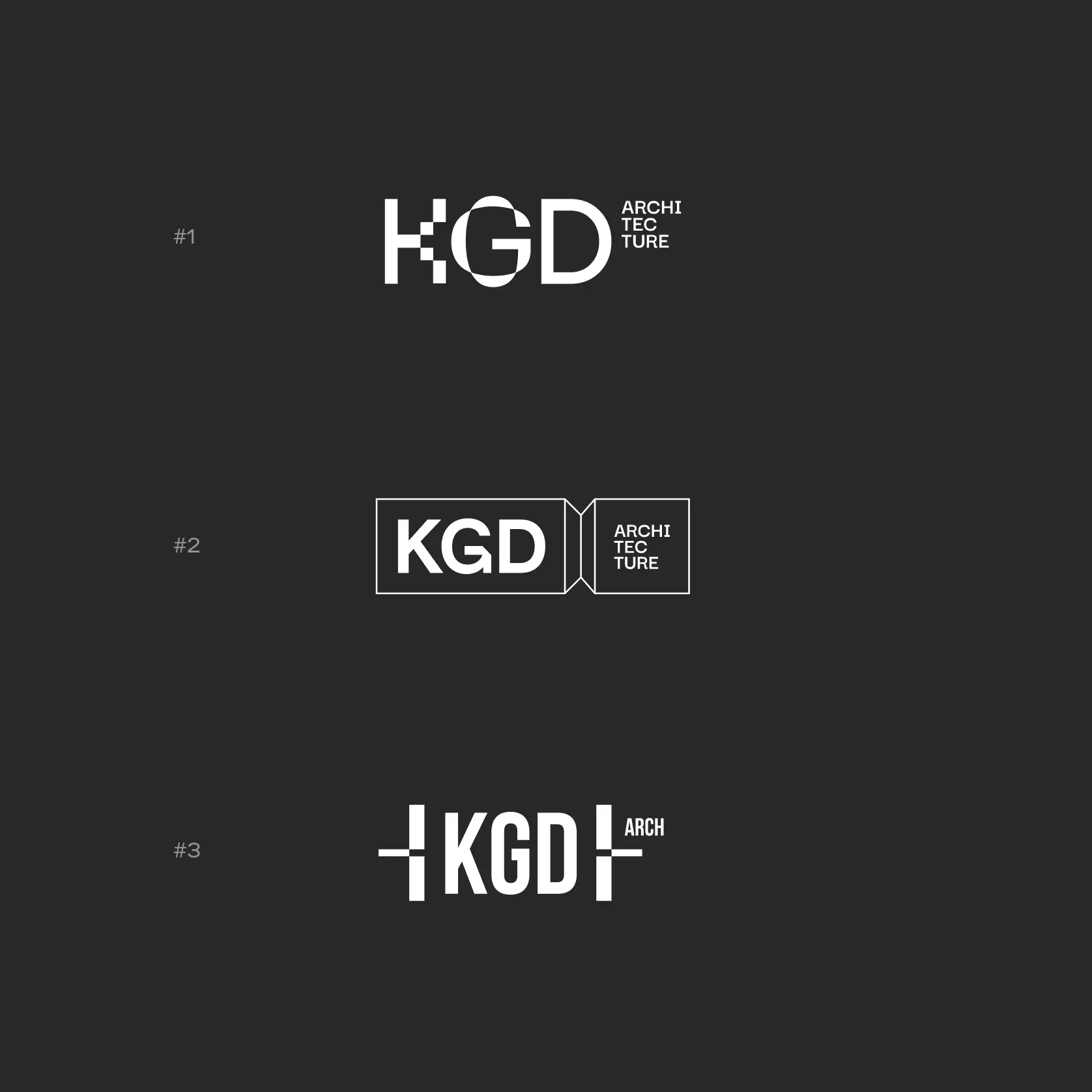
We prepared multiple logo redesign options that underlined said values from multiple varying angles, and they elicited long internal conversations. It’s one thing to evaluate drafts, and something else entirely to look at options that will grace every element of your company–including massive neon signs!

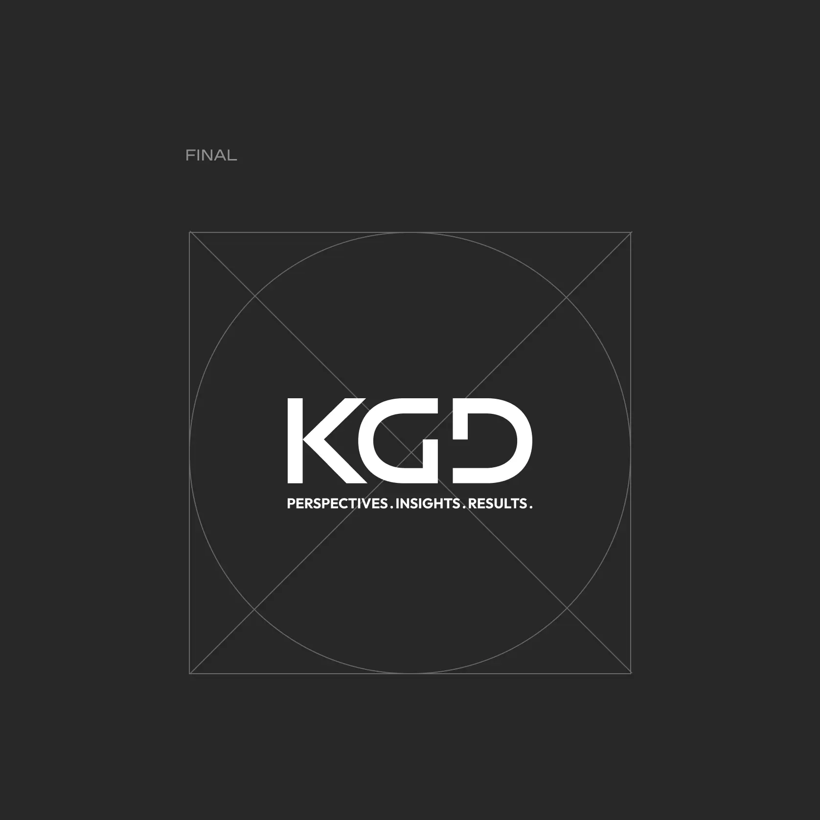
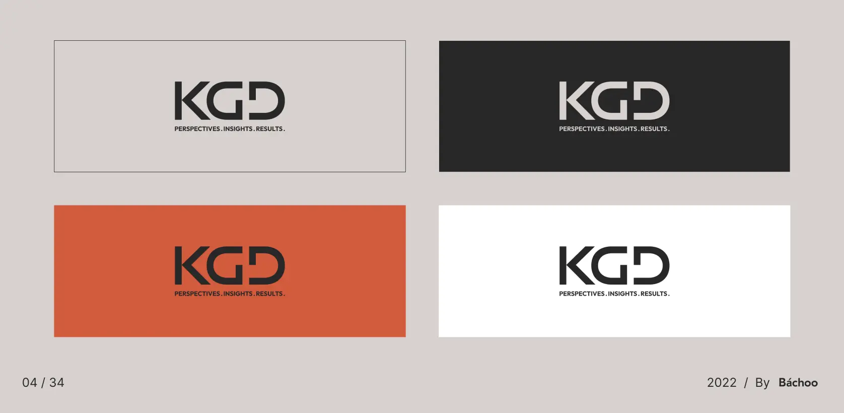
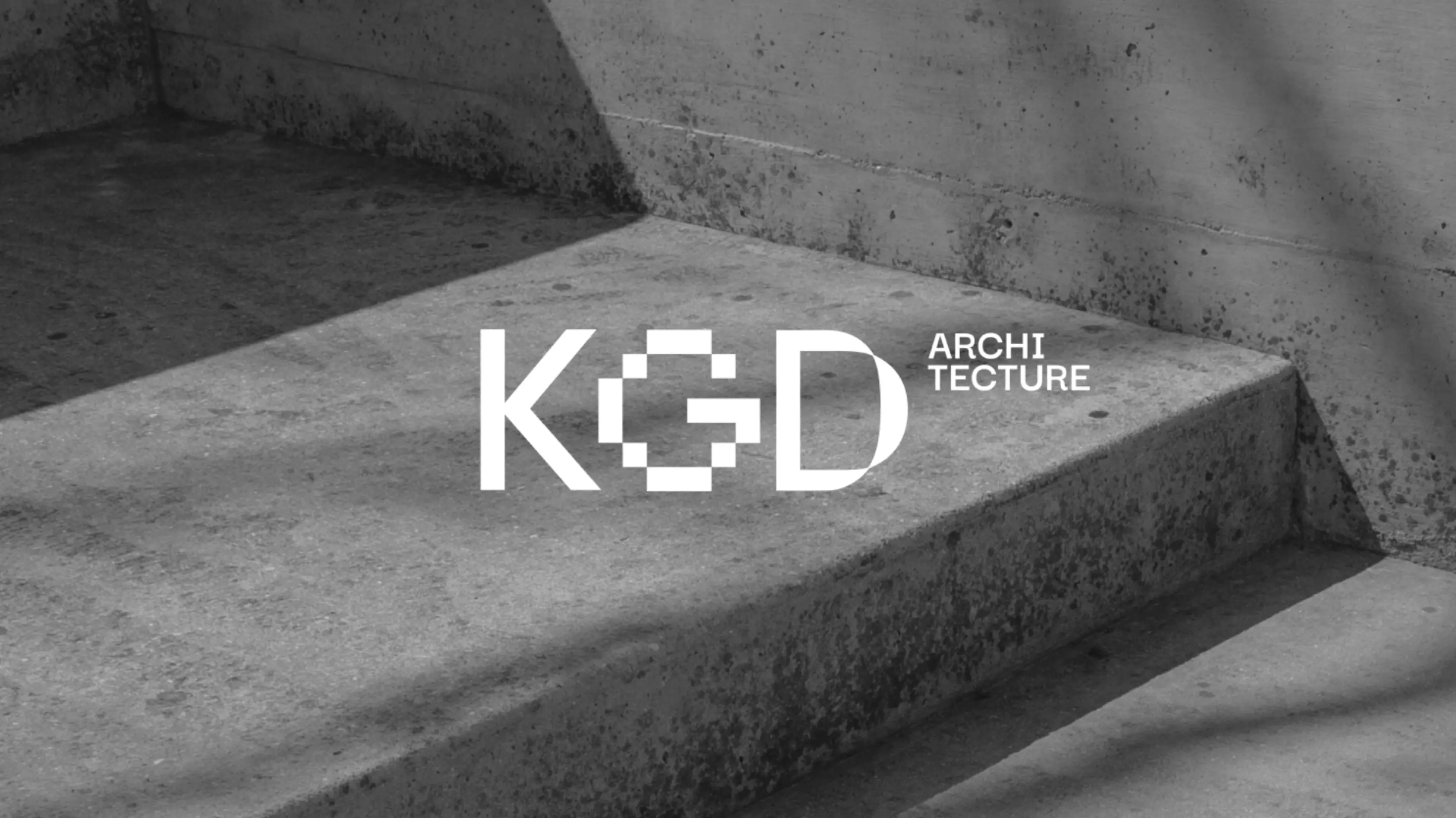
It was mutually agreed that the well-known KGD logo should remain the same, and everything else go through an overhaul. We’ve created a new visual branding that implemented the logo as part of a whole picture instead of being a key element. Did anyone say “organic, please?”
img 01
img 3
img 02
1 (9)
img 04

Vision

Vision? Humans first.

One of KGD’s core values is to put the tenants center-stage, and we’ve mimicked that in the design. Sensory, comfortable, and functional were all cornerstones of our vision for KGD’s visual overhaul, and we’ve made it work seamlessly with the architecture aspect of it all.

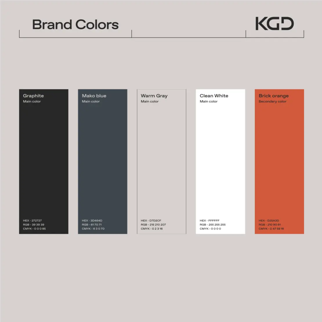
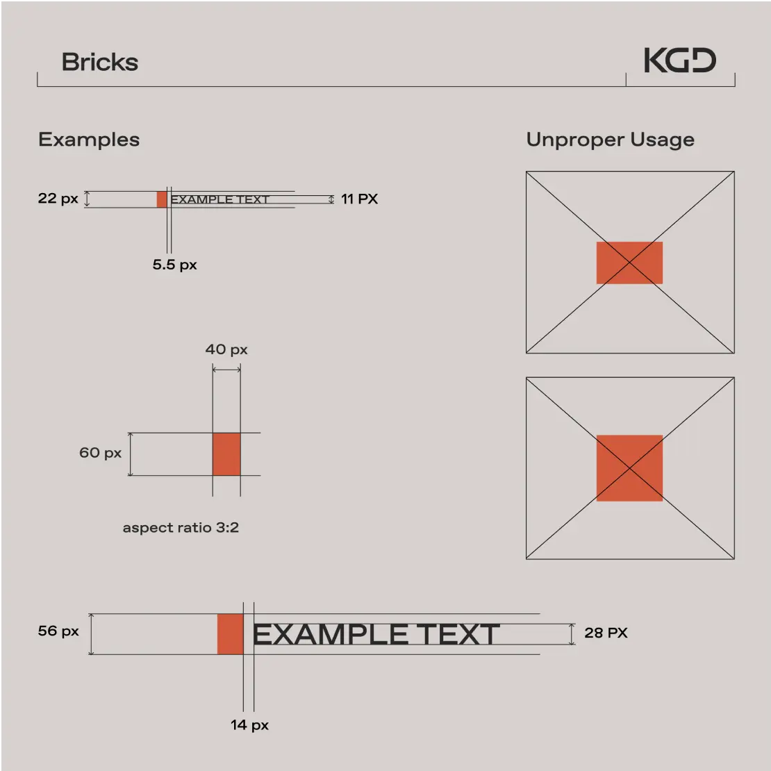
We’ve designed with natural colors in mind, the type of shades you’ll see in real life. To ensure a perfect synergy – the visual elements used thin lines and soft yet stern fonts reminiscent of architectural schematics.

Process

This one required finding our footing, but once we’ve had our feet firmly on the ground, the “foundation” stage turned into “project complete” fairly swiftly. An initial draft of our vision was presented to KGD early on, and after adjusting things to the clients’ liking, the final design was fleshed out and implemented swiftly.

long img
image 1241
image 1242
Images

More Projects

Please fill out
the form below.

The sooner you start, the sooner you’ll have it ready.

Introduce yourself.
Share your name and contact details so we can stay in touch.
/
Please enter your name
Please enter your email
Please fill in your company name
Project rundown.
Spill the beans! Tell us about your project vision, desired outcomes, and goals you're striving for.
/
Thank you.
We won't wait for three days to reply, you got us at "hello"!
Portfolio

We use cookies to improve our site and your shopping experience by delivering you engaging, personalised content and advertising. You can manage cookies via your browser setting at any time, or click Accept to agree to our Cookies Policy.