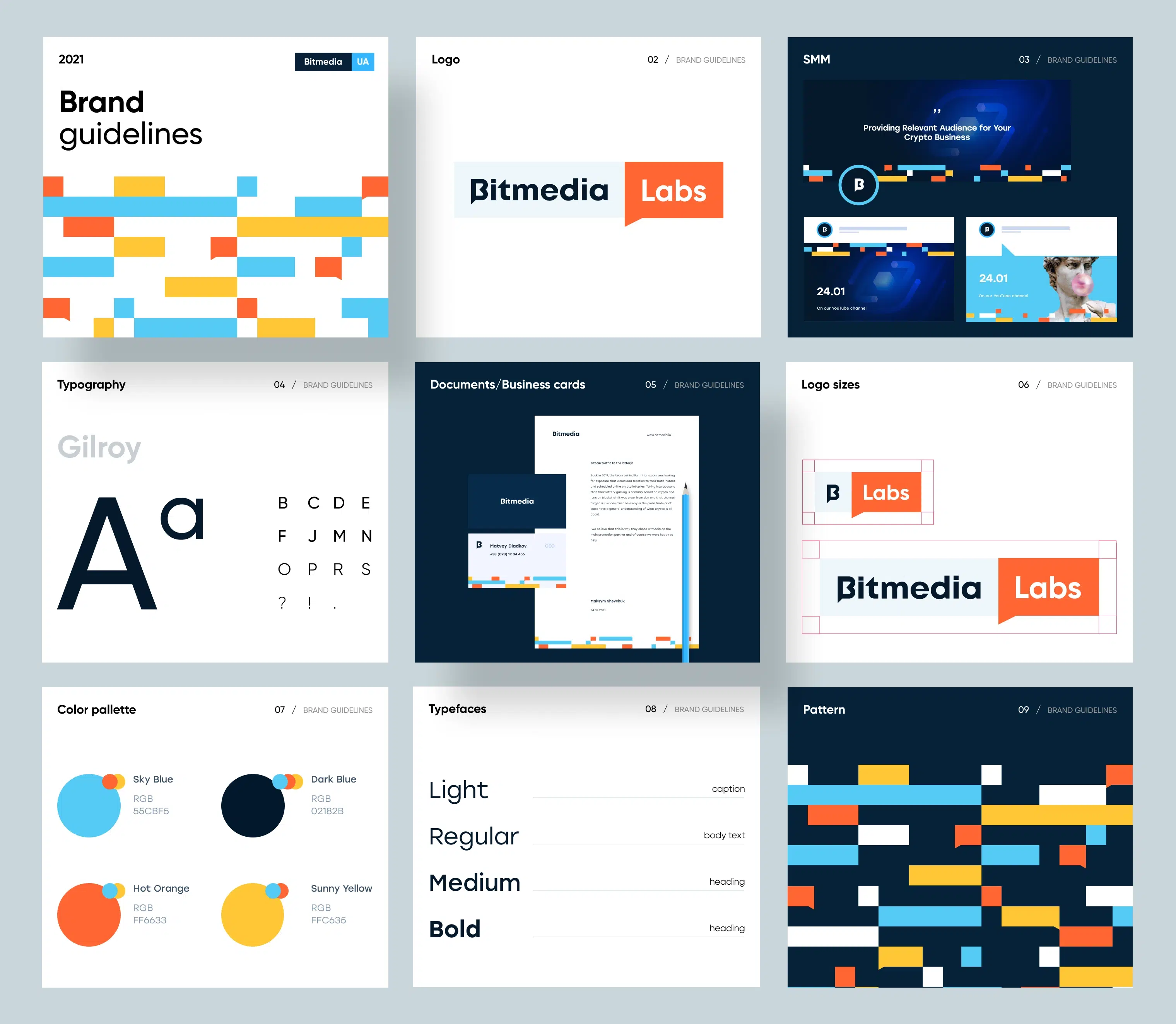
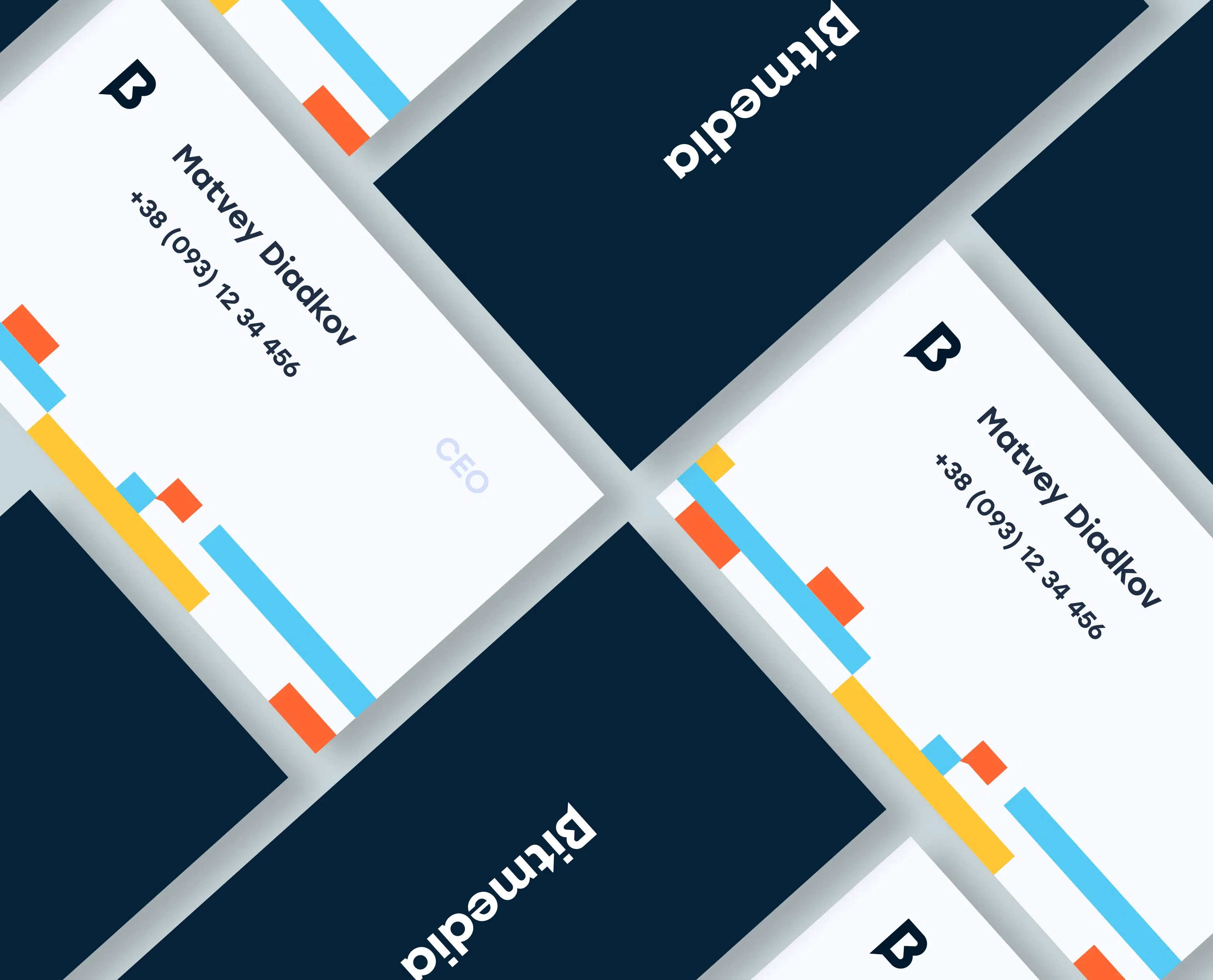
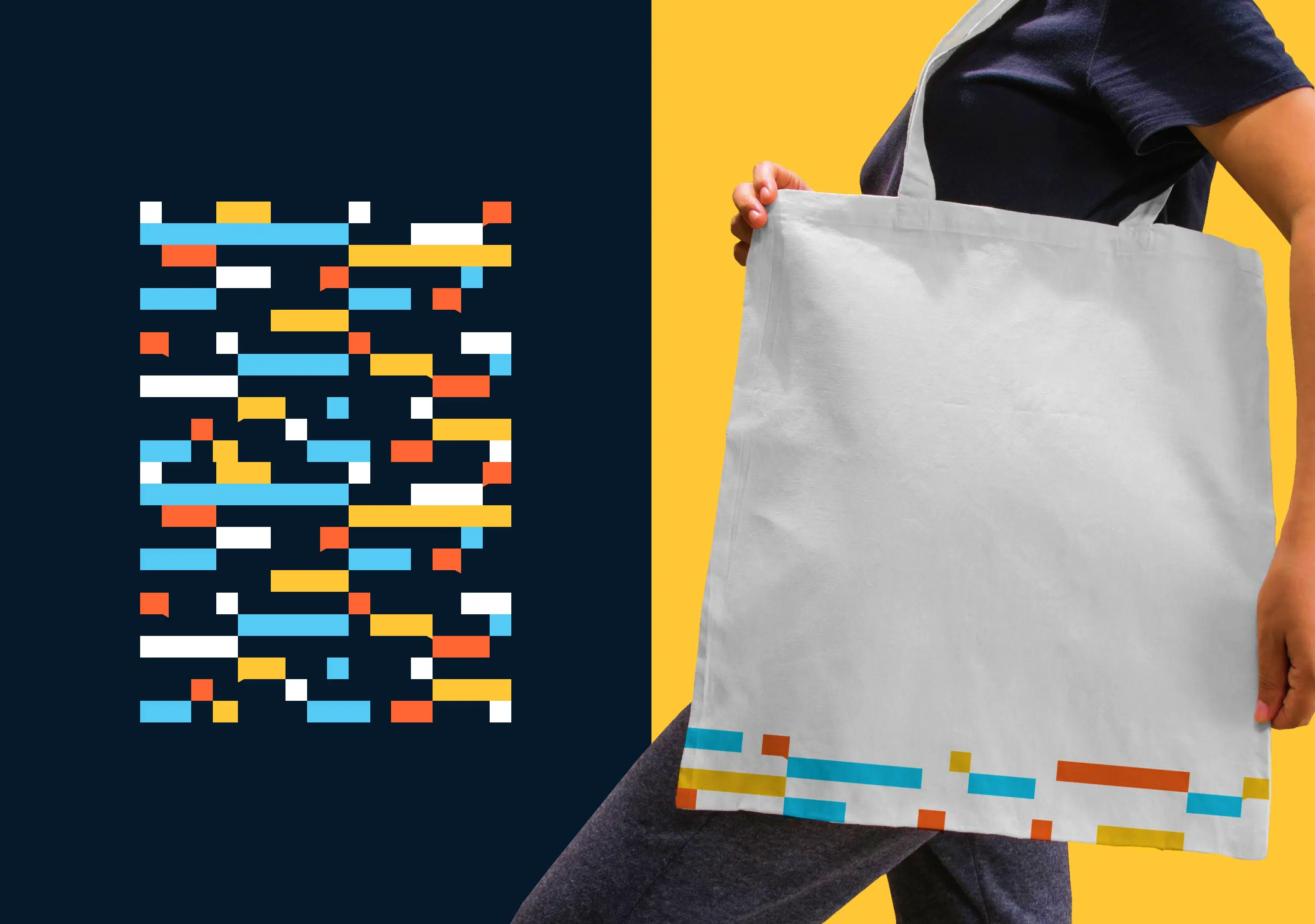
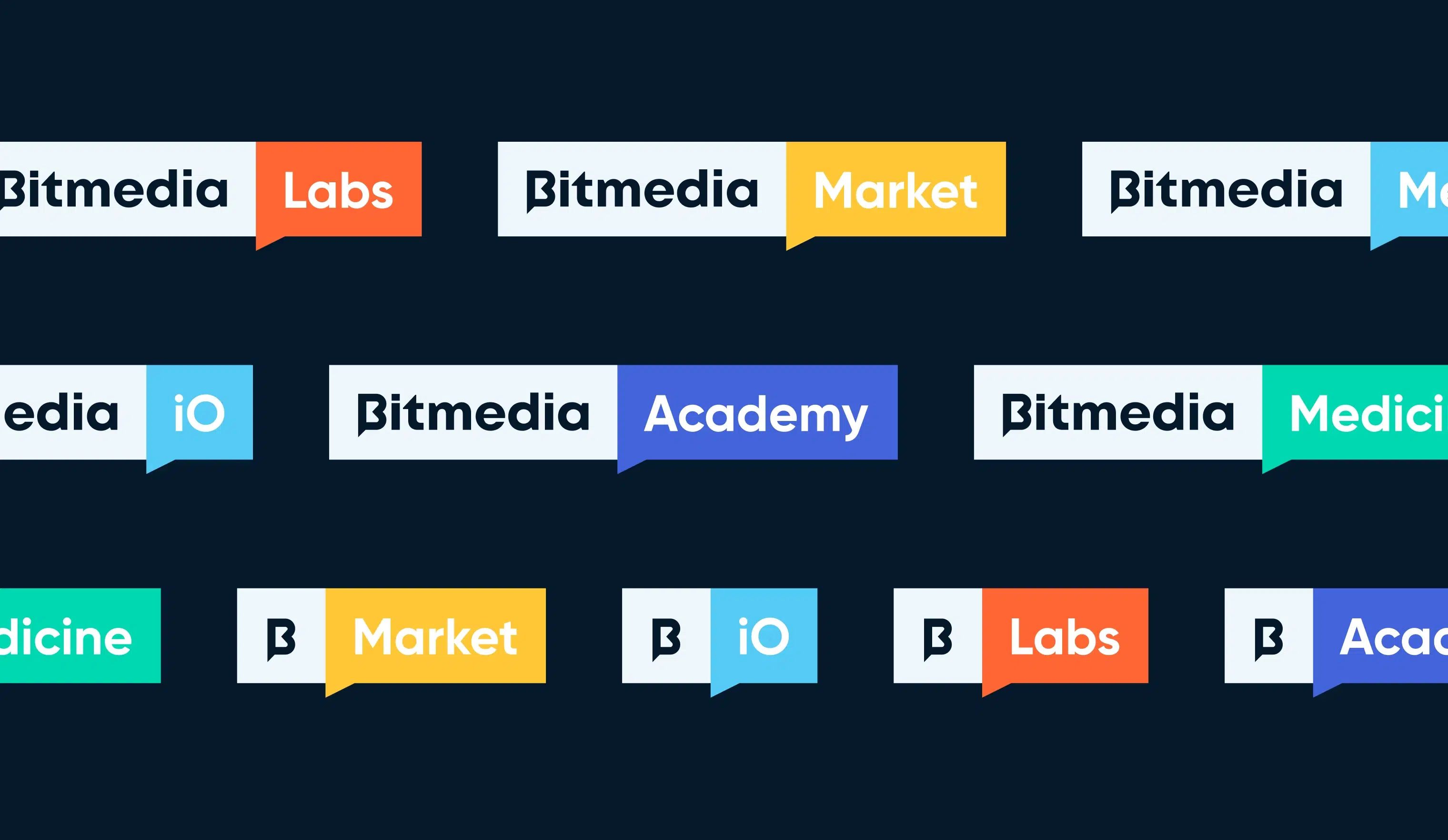
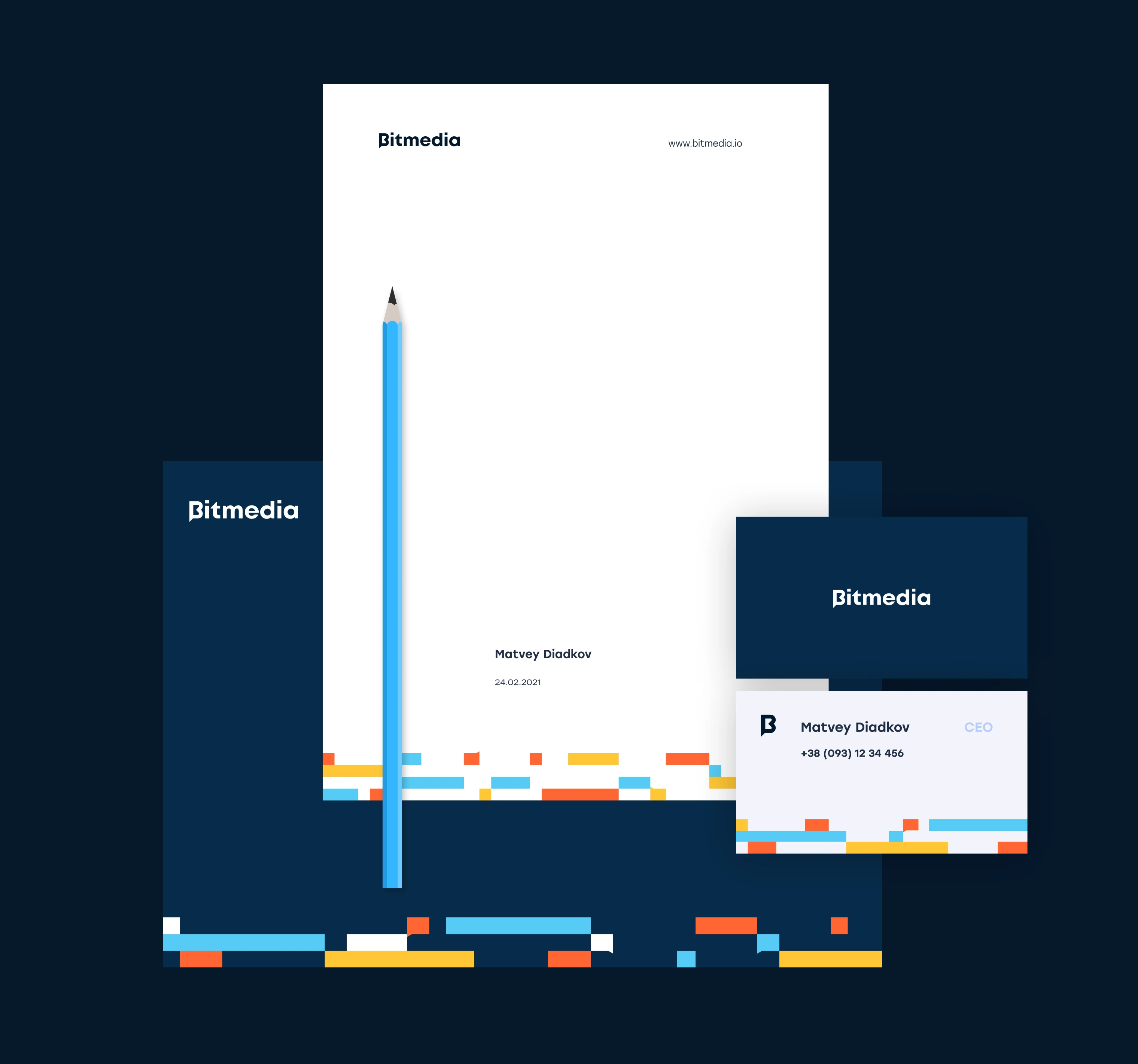
Bitmedia.io is like a jack-of-all-trades when it comes to digital advertising and marketing for all you crypto-heads out there. They’ve got their hands in several different directions, with a bunch of products that are their own independent bosses. And guess what? There are even more new products on the horizon! With all of these exciting developments, it’s time for Bitmedia.io to revamp their branding game and make sure every branch is looking fresh and on point.
Power moves unleashed: Bitmedia's dynamic branding odyssey
The Challenge
We were faced with a challenge: to create an umbrella brand that would maintain the current logo of the main brand, which is already widely recognized. We also wanted to ensure consistent branding across all marketing tools, from the website to badges. To achieve this, we needed to develop a flexible logo variant and a set of visual elements that could be easily scaled for different materials and applications.
Our Vision
We settled on a really cool solution that’s both structured and flexible. Everything is built on blocks, from the logo to the patterns and grids, but don’t let that fool you. These aren’t your average blocks! We took the tail of the letter “B” from the old logo and turned it into a talking woman. It’s a clever way to keep the old logo connected to the new graphics.
The Twist
We had a blast brainstorming for the branding project and ended up going with a really cool concept. We’re talking digital streams, data transmission, and information exchange – sounds fancy, right? Well, we turned this complex idea into a fun and flexible pattern that emerged from our new logo design. It’s so versatile that we can create logos for new departments or spruce up existing ones with ease. Plus, the color differentiation makes it a no-brainer to spot that it belongs to a different team.